Maizal
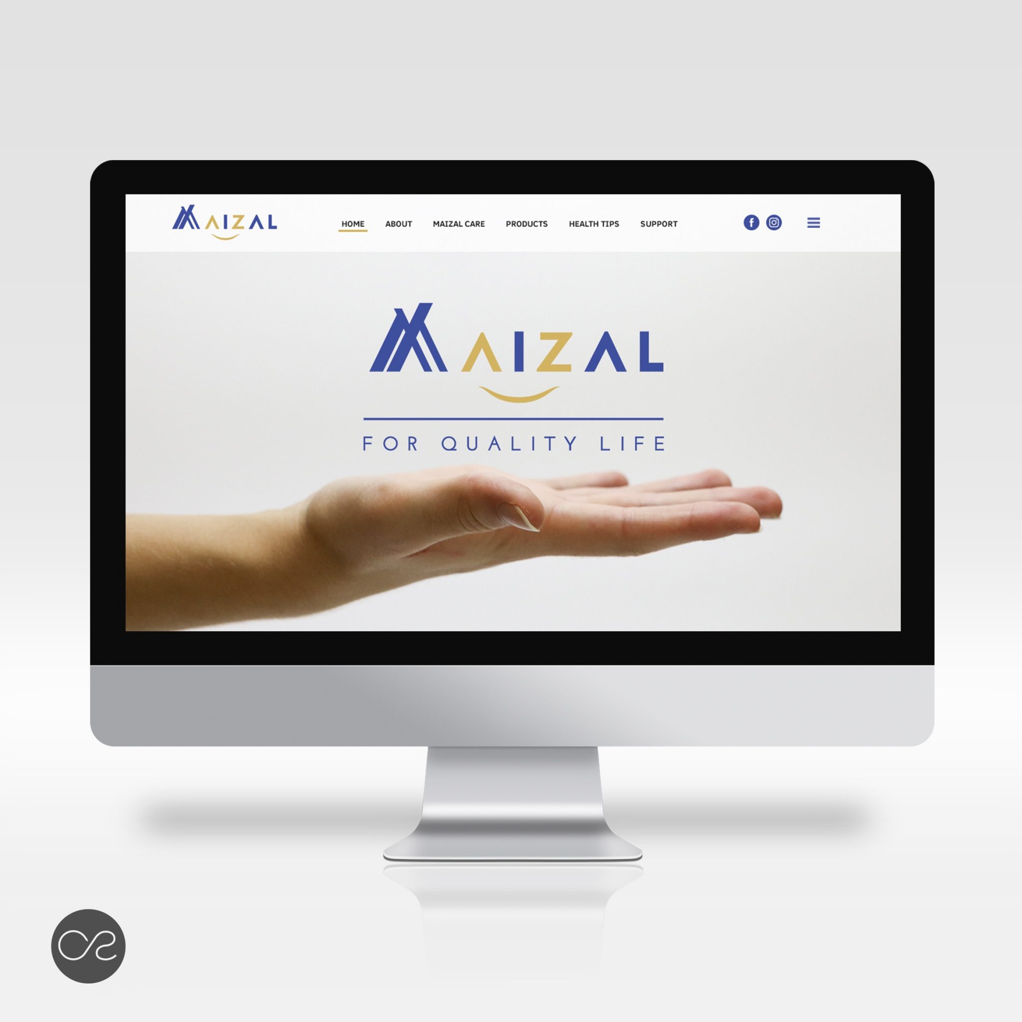
Maizal is a helthcare online platform based in Singapore. The customer asked for a new brand identity, with special emphasis on the logo – it should be strong and full of meaning.
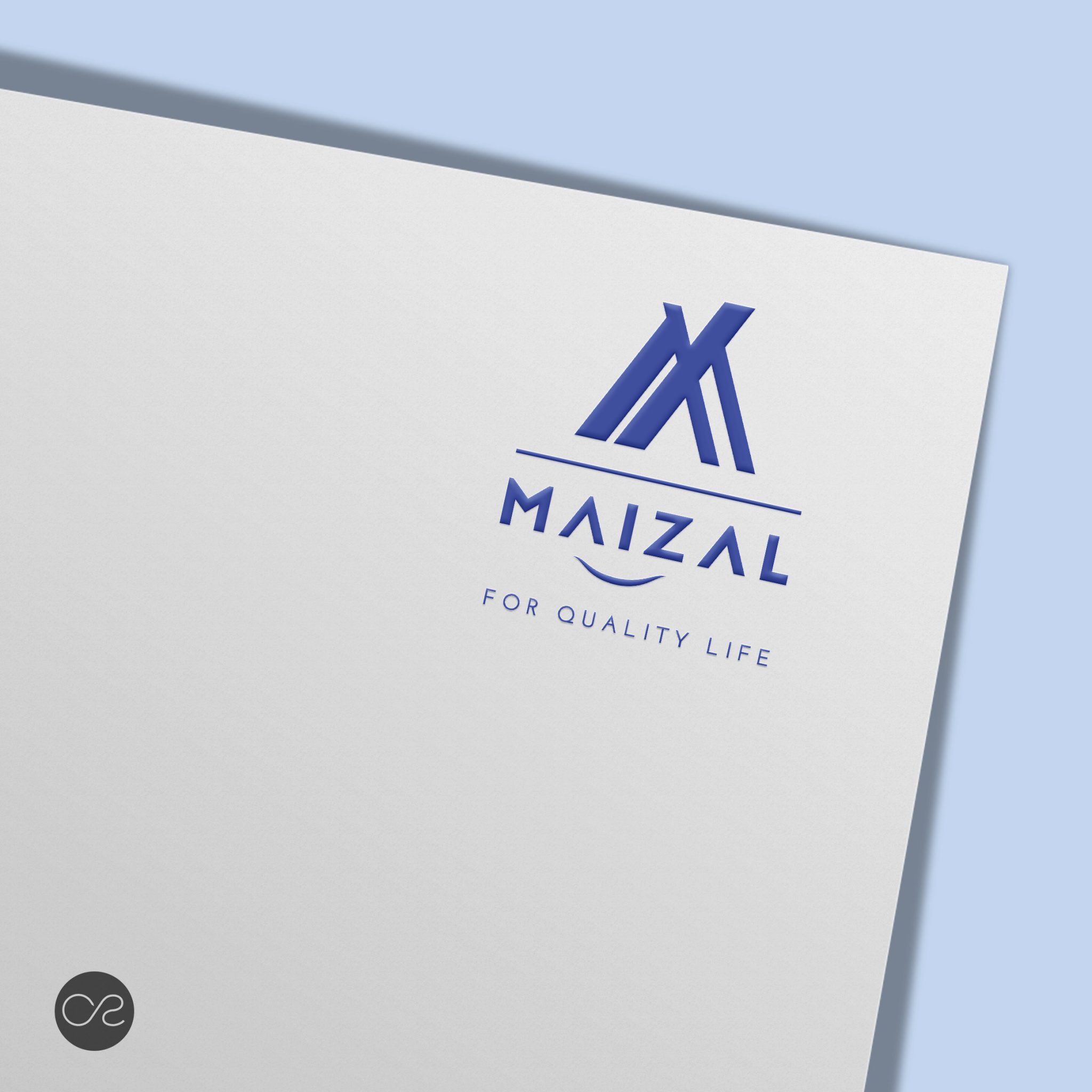
The layout of the Maizal’s logo is focused on the “M” letter so it can be used integrated in the Maizal word and also as a stand-alone logo.
“M” is composed by two Chinese Characters – Enter & People – referring to the desire of the company to enter people’s life.
The wave that connects A to Z expresses the large scope of services that the company aims to provide.
For the color palette we wanted to marry the theme “healthcare” and “tech”. Therefore the dominant color is a navy blue gives the logo a sense of tranquility and peace. As Maizal means Cornfield in Spanish the use of a tosted/gold yellow aims to softly represent the cornfield.
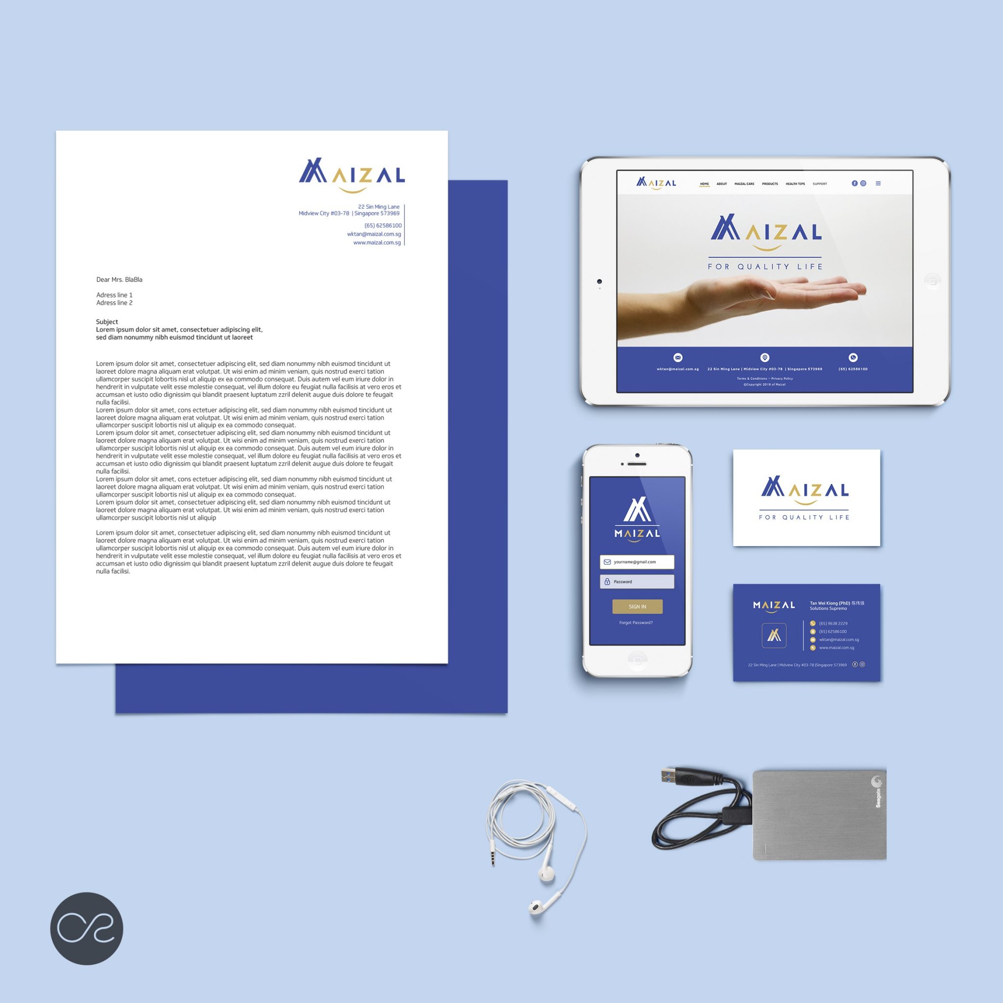
We’ve created various stationary elements and also the website design.


